As an Amazon Associate, I earn from qualifying purchases. Privacy Policy / Terms
Monochromatic color schemes are making a bold comeback. They’re set to be a major design trend in 2025.
But what exactly are monochromatic color schemes? They’re color palettes derived from a single base hue, extended using its shades, tints, and tones.
These color schemes are not just aesthetically pleasing. They also play a crucial role in color harmony and color theory.
From interior design to fashion, branding to digital interfaces, monochromatic colors are versatile. They can create a cohesive, harmonious, and impactful design statement.
This article will delve into the world of monochromatic color schemes. We’ll explore their relevance in 2025, their psychological impact, and their application in various industries.
So, whether you’re a designer, a brand manager, or a color enthusiast, stay tuned. This is one trend you can’t afford to ignore.
Understanding Monochromatic Color Schemes
Monochromatic color schemes revolve around a single hue. They expand this hue with variations in shade, tint, and tone.
The beauty of monochromatic schemes lies in their simplicity and coherence. They provide a seamless flow of color without the risk of clashing.
By using variations of one color, designers can create unity. This unity evokes harmony that feels both peaceful and connected.
These schemes are not limited to any specific color. From soft pastels to bold primary colors, any hue can create a dramatic effect.
The approach requires an understanding of subtle variations. An effective monochromatic scheme plays with depth, adding interest and dynamics.
It’s a perfect strategy for those seeking elegance and sophistication. Monochromatic schemes are thus integral to modern design.
The Basics of Color Theory
Color theory underpins every successful design. It guides how colors interact and how they affect viewers.
In design, color theory provides a framework for creating visual harmony. It’s essential for choosing colors that complement or contrast effectively.
Within this framework, monochromatic schemes offer a unique advantage. They ensure harmony by focusing exclusively on one hue.
This singular approach can simplify decision-making. It also enhances coherence across different design elements.
Understanding color theory helps leverage monochromatic schemes to their fullest. This knowledge ensures impactful and appealing designs.
Components of Monochromatic Schemes: Shade, Tint, and Tone
Shades, tints, and tones are the building blocks of monochromatic schemes. They are essential for introducing variety within a single color palette.
A shade is achieved by adding black to a hue. This creates a darker, more intense version of the original color.
Tints are created by adding white to a hue. This results in a lighter, softer iteration of the original color.
Tones, on the other hand, involve adding gray. They produce a more muted version, adding complexity to the palette.
Each component contributes differently to the overall effect. Shades can add depth, tints can introduce lightness, and tones can bring balance.
Together, they offer a rich and versatile palette. This range makes monochromatic schemes adaptable to various design goals and settings.
The Psychological Impact of Monochromatic Colors
Monochromatic color schemes can strongly influence emotions and moods. They create a sense of consistency and calm.
This effect can be particularly powerful when used in spaces for relaxation. For instance, a blue monochromatic scheme can feel serene and tranquil.
In work environments, monochromatic schemes can enhance focus. The subtle variations help reduce distractions, promoting productivity.
Retail spaces often use monochromatic schemes to guide consumer behavior. A single-color palette can highlight products and encourage purchasing decisions.
Ultimately, the psychological impact can vary based on the color chosen. Each hue carries its own set of emotional responses.
Color Psychology in Monochromatic Design
Color psychology plays a crucial role in design. It influences how people perceive and react to their environment.
In monochromatic design, this understanding becomes even more vital. The single-color approach intensifies the emotional response to that color.
Different colors evoke different feelings. For example, green might bring a sense of peace, while red can evoke energy and urgency.
The monochromatic setting amplifies these emotions by focusing them. Designers leverage this in creating spaces that communicate a specific mood.
When applied thoughtfully, color psychology in monochromatic design can transform spaces. It sets the tone in ways that are both subtle and profound.
Monochromatic Color Schemes in Action
Monochromatic color schemes find numerous applications in various fields. They are popular in interior design, creating sophisticated and unified spaces.
Fashion designers also embrace these schemes for their sleek and timeless appeal. This approach offers a canvas to experiment with different textures and materials.
In technology, user interfaces often utilize monochromatic palettes for simplicity and clarity. This enhances user experience by making interfaces more intuitive.
From minimalism to complex aesthetics, monochromatic schemes adapt easily. Their versatility ensures they remain relevant in diverse industries.
Case Studies: Successful Monochromatic Designs
Successful designs leverage monochromatic schemes to enhance visual impact. Consider Apple’s branding; their iconic use of white creates a clean and futuristic look. This monochromatic design promotes simplicity, aligning with their brand philosophy.
Another example is Tiffany & Co., recognized for its signature blue. This distinct shade not only reinforces brand identity but evokes luxury and elegance. The consistent use of this color deepens customer recognition and loyalty.
In architecture, Frank Lloyd Wright’s Fallingwater uses earth tones to blend with its natural surroundings. The monochromatic scheme accentuates the home’s integration with its landscape.
Graphic design also benefits from monochromatic palettes. A publication like The New Yorker utilizes black-and-white for a classic, timeless appearance. This choice enhances readability and gives the publication a distinctive identity.
Retail spaces, like those of Muji, adopt monochromatic schemes, emphasizing simplicity and function. These spaces feel cohesive, encouraging customers to explore and interact with products.
These case studies show the effectiveness of monochromatic schemes when applied thoughtfully. They demonstrate the power of a unified color approach across different contexts.
Monochromatic Trends in Various Industries
Monochromatic trends continue to evolve, impacting multiple sectors. In fashion, monochrome is an ongoing trend with seasonal updates in shades and fabrics.
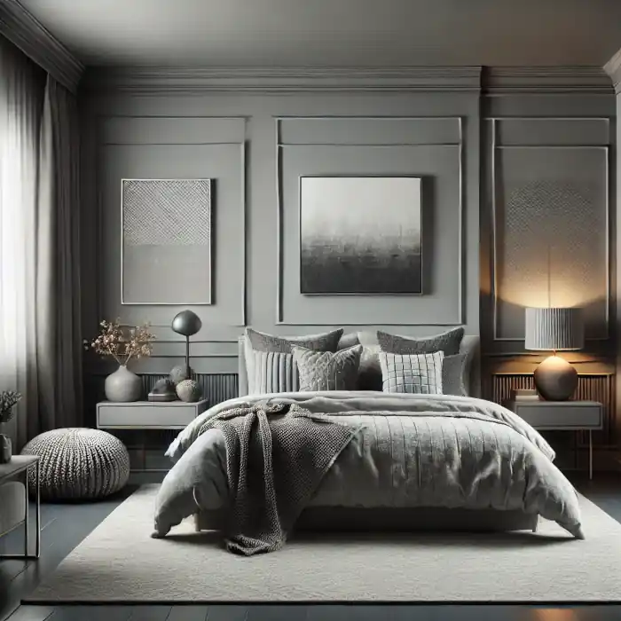
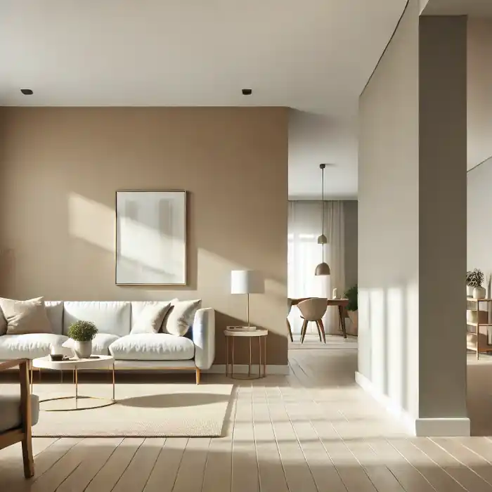
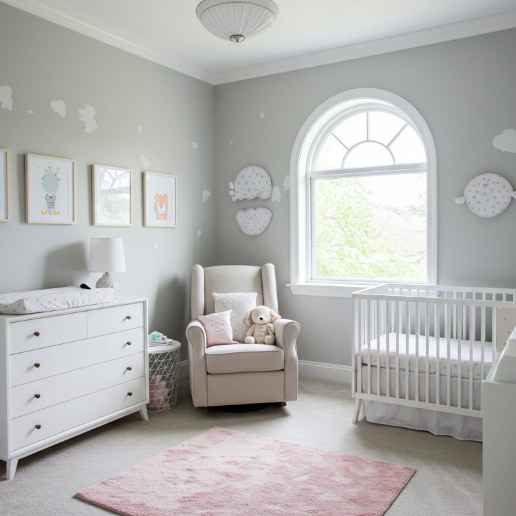
Interior designers explore these palettes to create serene yet striking environments. Monochromatic schemes can transform a space into an elegant retreat or a modern showroom.
In digital design, the trend is gaining momentum for its clarity. Apps and websites employ these schemes to improve functionality and aesthetics.
Branding often utilizes monochromatic colors to strengthen identity. Brands find a single-color palette provides visual consistency across platforms.
Even in the art world, monochromatic schemes allow for bold expressions with few elements. Artists explore depth and contrast, turning simplicity into a complex narrative.
How to Craft the Perfect Monochromatic Palette
Creating a monochromatic palette starts with a keen understanding of color. Begin by selecting a base color that reflects your desired atmosphere.
From this base, explore various shades, tints, and tones. Each variation adds depth and dimension to the palette.
Remember to consider the context where the palette will be used. A palette ideal for a cozy room might not suit a corporate setting.
Experimentation is key. Adjusting elements like texture and pattern can significantly enhance your monochromatic design.
Choosing Your Base Color
Selecting the right base color sets the tone for your entire scheme. Begin by considering the purpose and emotion you wish to convey.
A cool blue can evoke calmness, while a warm red may inspire passion. Evaluate the environment and how the color will interact with other elements.
Cultural perceptions may also influence your choice. Some colors carry different meanings across cultures, impacting their suitability.
Once you decide on a color, build your palette around its subtle variations to maintain harmony.
Balancing Your Scheme with Texture and Pattern
Texture and pattern are essential in bringing life to a monochromatic palette. Textural contrasts keep the scheme from feeling flat or monotonous.
Incorporating different materials can introduce tactile interest and sophistication. Imagine a room with velvet curtains and a rough stone wall.
Patterns offer another layer of complexity, introducing movement and energy. Consider geometric patterns for a modern look or organic patterns for a softer feel.
Aim for a balance where texture and pattern complement the base color, adding visual richness without overwhelming it.
Lighting and Its Influence on Perception
Lighting profoundly affects how we perceive monochromatic colors. Natural light changes throughout the day, altering color appearances subtly.
Warm lighting can enhance warm color palettes, making them feel inviting. In contrast, cool lighting may lend a modern edge to your scheme.
Experiment with lighting to understand its impact on your chosen palette. Different sources can create varying effects, adding or subtracting vibrancy.
Proper lighting ensures your monochromatic design looks its best, enhancing the intended mood and atmosphere.
Monochromatic Color Schemes: Beyond Aesthetics
Monochromatic schemes do more than please the eye. They serve practical functions, impacting mood and behavior profoundly.
These color schemes simplify design processes, offering clarity and focus. In environments like healthcare, they promote healing and calm.
Adopted in urban planning, they enhance visual harmony, contributing to a city’s aesthetic and operational unity. Designers favor monochromatic palettes for their efficiency and effectiveness.
Beyond the surface, such schemes can enrich the environment, influencing emotions and enhancing user experience.
Cultural Significance and Interpretation
Cultural context shapes how monochromatic colors are perceived. In different regions, colors carry unique meanings and emotions.
For instance, white might signify purity in some cultures, while in others, it represents mourning. Designers must consider these nuances to communicate effectively.
Using culturally informed palettes builds bridges in multicultural environments. It enhances relatability and reinforces cultural narratives.
Understanding these cultural interpretations ensures that color schemes resonate with intended audiences, enhancing communication and connection.
Monochromatic Colors in Sustainable Design
Sustainable design increasingly features monochromatic palettes. Such schemes allow for minimalism, reducing material waste and supporting eco-friendly practices.
Using fewer colors in production processes can cut emissions and resource use. It provides a streamlined approach that aligns with sustainable goals.
These palettes also highlight natural materials, which are crucial in green design. They underscore the importance of resource consciousness in modern design paradigms.
By embracing simplicity, monochromatic schemes contribute to a more sustainable future, balancing aesthetics with environmental responsibility.
The Future of Monochromatic Color Schemes
Looking ahead, monochromatic color schemes are set to evolve. Their role in digital and physical environments will expand significantly.
These schemes offer simplicity and sophistication, perfect for our fast-paced future. They will dominate design across industries, from fashion to architecture.
Monochromatic schemes will also promote accessibility, ensuring designs are more inclusive and user-friendly. By embracing these palettes, designers can pioneer innovative solutions.
Expect these schemes to influence everything from product packaging to urban development. They provide a visual language that meets modern needs with elegance and clarity.
Innovations in Digital and Interactive Spaces
In digital spaces, monochromatic schemes bring focus. They improve user interfaces by reducing distractions and enhancing usability.
These schemes provide clean, intuitive layouts, crucial for effective digital interactions. Monochromatic designs simplify user experiences, making technology more engaging and accessible.
In interactive spaces, they convey information clearly, guiding users seamlessly through tasks. Bold yet simple, these palettes cater to a tech-savvy audience.
Leveraging these innovations can enhance engagement, paving the way for a more user-centric digital future.
Adapting Monochromatic Schemes for Future Trends
Adapting monochromatic schemes involves staying ahead of trends. Designers must anticipate shifts in preferences and technology.
As trends evolve, these schemes will merge with new materials and techniques. This evolution will create fresh, exciting visual experiences.
Monochromatic palettes can easily integrate with emerging sustainable practices, aligning with eco-friendly initiatives. Future trends will see them applied in innovative, surprising ways.
By remaining flexible, designers can utilize these schemes to keep designs relevant and forward-thinking. This adaptability ensures timeless appeal in a changing world.
Conclusion: Embracing Monochromatic Color Schemes in 2025
As we move towards 2025, monochromatic color schemes stand out as a pivotal trend in design. Their ability to offer both simplicity and depth makes them uniquely valuable.
These schemes provide a balance of elegance and functionality. They cater to diverse design needs, whether in minimalistic or bold approaches. Such versatility allows them to fit effortlessly into various sectors, from branding to digital interfaces.
Understanding and applying monochromatic schemes can significantly enhance aesthetic appeal. By embracing this trend, designers can create cohesive, impactful visuals that resonate with audiences.
Indeed, monochromatic palettes are more than just a trend. They represent a strategic tool for enhancing design in a future increasingly defined by clarity and sophistication.
Views Expressed Disclaimer
The views, opinions, and information presented in this article are for informational purposes only and do not necessarily reflect the official policies or positions of Chagrin Falls Painting. While every effort has been made to ensure accuracy, Chagrin Falls Painting is not liable for any errors, omissions, or decisions made based on the content provided. Readers are encouraged to consult professionals for specific advice or assistance related to their unique circumstances.


