
As an Amazon Associate, I earn from qualifying purchases. Privacy Policy / Terms
Paint colors have always been more than just decorative choices; they reflect societal shifts, cultural movements, and technological advancements. From the muted tones of the early 1900s to the bold hues of the 1980s, each era tells a unique story through color. Join us as we look at how popular paint colors have changed over the decades. We will see how these trends affect how we view our living spaces today.
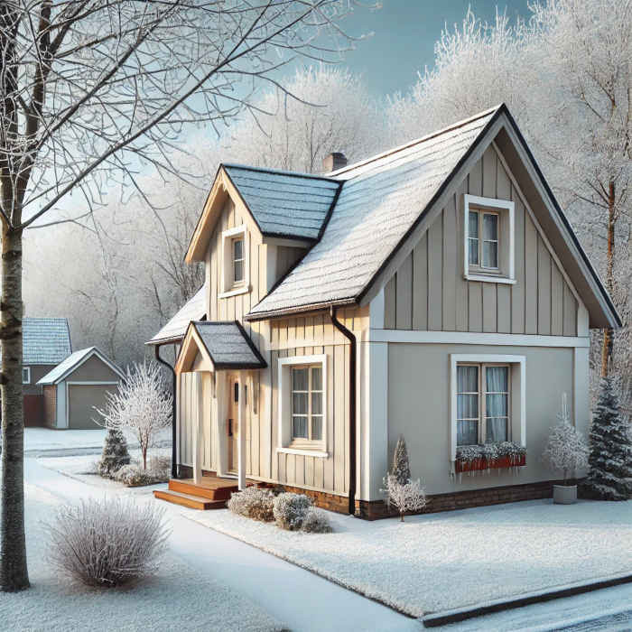
1900s-1920s: Earthy Tones and Natural Hues
At the turn of the 20th century, homes were painted with colors inspired by nature. Earthy greens, soft browns, gentle grays, and deep reds filled the color palette. These colors show the Arts and Crafts movement’s focus on craftsmanship and natural materials. These shades were seen as comforting and grounding, ideal for creating a cozy and warm home environment.
Key Colors of the Era:
- Olive Green
- Burnt Sienna
- Warm Beige
- Deep Brick Red
Why It Mattered:
This period marked a shift from Victorian excess to a more restrained, nature-inspired aesthetic. Paint became more widely available, allowing homeowners to experiment with new color choices. The development of synthetic pigments also provided more consistency and durability in paints, making vibrant colors more accessible to the average homeowner.
Influence on Modern Design:
Many of these earthy tones continue to influence modern rustic and farmhouse designs. Today’s popular interior design trends still focus on natural materials and soft colors. This shows a timeless appeal.
1930s-1940s: Soft Pastels and Cheerful Hues
During the Great Depression and World War II, homes were often painted in soft pastels and bright colors. This was done to create a feeling of hope and optimism. Light blues, mint greens, pale yellows, and peach tones were popular. They showed a wish to add brightness and cheer to daily life, even during tough times.
Key Colors of the Era:
- Mint Green
- Sky Blue
- Butter Yellow
- Peach
Why It Mattered:
These colors were not just aesthetic choices but also psychological tools. Soft pastels brightened moods during hard times. New paint technology made it easier to create these lighter colors. Additionally, the introduction of mass-produced paints allowed for greater color variety and affordability, making it easier for homeowners to personalize their spaces.
Influence on Modern Design:
Pastel colors have remained popular in various design movements, from vintage-inspired interiors to modern minimalist aesthetics. The calming effects of these hues make them a perennial favorite for nurseries, bathrooms, and kitchens.
1950s: Bold, Vibrant Colors and Mid-Century Modern Influence
The post-war boom brought a surge of optimism and prosperity, reflected in the bold, vibrant colors of the 1950s. The Mid-Century Modern movement loved clean lines and bold colors. Homeowners enjoyed shades like turquoise, coral, sunny yellow, and avocado green. Kitchens, in particular, became colorful hubs of the home.
Key Colors of the Era:
- Turquoise
- Coral Pink
- Avocado Green
- Sunny Yellow
Why It Mattered:
With the rise of suburban living and mass-produced homes, color became a way for homeowners to express individuality. The vibrant palette of the 1950s symbolized a fresh start and a break from the past. Appliances and furniture started to show these bold colors. This made the whole home a way to express oneself.
Influence on Modern Design:
The resurgence of Mid-Century Modern design has brought many of these bold colors back into vogue. Today, homeowners use these retro hues to add a playful, nostalgic touch to contemporary spaces.
1960s: Psychedelic Patterns and Bright, Experimental Colors
The 1960s were all about breaking boundaries, and this was reflected in home décor as well. Psychedelic patterns filled the scene. Bright oranges, hot pinks, and electric blues stood out. These colors were influenced by the counterculture movement and a growing interest in space exploration.
Key Colors of the Era:
- Electric Blue
- Hot Pink
- Tangerine Orange
- Lime Green
Why It Mattered:
The bold colors of the 1960s reflected the era’s social upheaval and cultural experimentation. Homeowners embraced daring hues as a form of self-expression, moving away from traditional color schemes. The influence of pop art and artists like Andy Warhol also encouraged bold, unconventional color choices.
Influence on Modern Design:
The psychedelic patterns of the 1960s are not as common today. However, the spirit of bold and experimental color still exists. You can see this in eclectic and bohemian design styles. Accent walls and statement pieces often draw inspiration from this colorful decade.
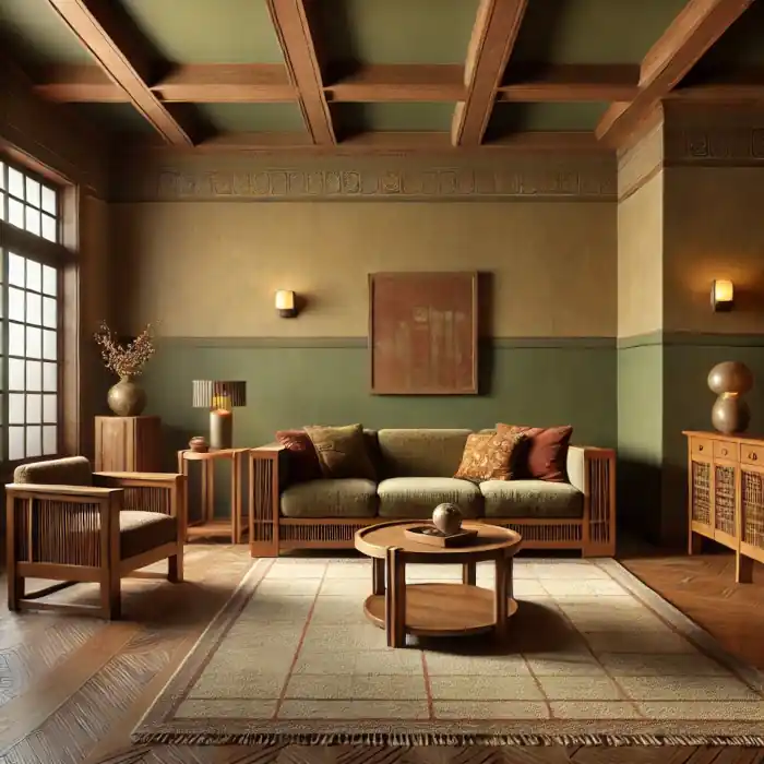
1970s: Earth Tones Return with a Retro Twist
The 1970s saw a return to nature-inspired colors but with a distinctly retro feel. Mustard yellows, burnt oranges, avocado greens, and rich browns filled the scene. These colors show the growing influence of the environmental movement. They also express a wish for homes to feel warm and grounded.
Key Colors of the Era:
- Mustard Yellow
- Burnt Orange
- Avocado Green
- Chocolate Brown
Why It Mattered:
The earth tones of the 1970s represented a shift towards sustainability and a back-to-basics mentality. While these colors were natural, they also carried the decade’s distinctive funky, retro vibe. The rise of open floor plans and natural materials like wood and stone complimented these earthy hues.
Influence on Modern Design:
Today, the 1970s color palette has made a comeback in boho-chic and retro-inspired interiors. Mustard yellow and burnt orange are often used as accent colors, bringing warmth and vibrancy to modern spaces.
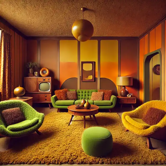
1980s: Bold, Bright, and Sometimes Over-the-Top
The 1980s were a time of excess, and home décor reflected this with bold, bright colors and eclectic combinations. Neon pinks, purples, teal blues, and metallics were all the rage. The Memphis Design movement, with its playful, geometric shapes and clashing colors, made its mark on interiors everywhere.
Key Colors of the Era:
- Neon Pink
- Teal Blue
- Royal Purple
- Metallic Silver
Why It Mattered:
The bold colors of the 1980s reflected the decade’s confidence and love for standing out. Homes became canvases for personal expression, with color choices often as daring as fashion trends. The rise of MTV and pop culture icons influenced the vibrant, dynamic palettes seen in homes.
Influence on Modern Design:
Elements of 1980s design are resurfacing in contemporary interiors, particularly in playful, maximalist spaces. Neon accents and bold color pairings add energy and excitement to modern homes.
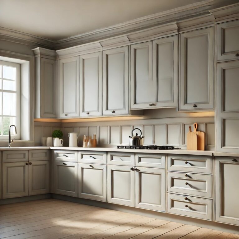
1990s: Muted Neutrals and Minimalist Vibes
After the bold excess of the 1980s, the 1990s saw a return to more subdued, neutral tones. Beige, taupe, sage green, and soft gray are popular colors in home décor. They show the trend for minimalist design and a wish for calm, peaceful spaces.
Key Colors of the Era:
- Beige
- Taupe
- Sage Green
- Soft Gray
Why It Mattered:
The muted palette of the 1990s represented a cultural shift towards simplicity and tranquility. As technology began to play a bigger role in daily life, people sought soothing environments at home. The popularity of Scandinavian design also influenced the preference for neutral, minimalist interiors.
Influence on Modern Design:
Neutral tones remain a cornerstone of contemporary design, offering versatility and timeless appeal. The 1990s’ emphasis on minimalism continues to influence modern interiors, promoting clean lines and clutter-free spaces.
2000s: The Rise of Cool Neutrals and Accent Walls
The early 2000s embraced cool-toned neutrals like gray and white, often paired with bold accent walls in deep blues or reds. This era saw a growing interest in modern, minimalist interiors, with homeowners gravitating towards clean, crisp color schemes.
Key Colors of the Era:
- Cool Gray
- Crisp White
- Navy Blue (as an accent)
- Deep Red (as an accent)
Why It Mattered:
This period reflected a blending of traditional and modern aesthetics. Neutral bases provided versatility, while accent walls allowed for bursts of personality. Modern technology and stylish design helped make cool, clean color schemes popular.
Influence on Modern Design:
Accent walls are still a popular design choice. They help homeowners add depth and interest to their rooms. This can be done without making the overall look too busy.
2010s: Soft, Warm Neutrals and the Popularity of “Greige”
The 2010s saw the rise of “greige”—a blend of gray and beige—as the go-to neutral. Soft, warm tones dominated, creating cozy, welcoming spaces. Blush pink, muted navy, and forest green became popular. These colors show a move towards more personal and cozy interiors.
Key Colors of the Era:
- Greige
- Blush Pink
- Muted Navy
- Forest Green
Why It Mattered:
This decade emphasized balance and warmth in interior design. The versatile nature of greige allowed homeowners to experiment with other colors while maintaining a cohesive look. Farmhouse-style interiors have become popular, thanks to shows like “Fixer Upper.” This trend has led to the rise of soft, warm neutral colors.
Influence on Modern Design:
The trend towards personalized, comfortable spaces continues to shape contemporary interiors. The blend of neutral bases with carefully chosen accent colors creates a harmonious and inviting atmosphere.
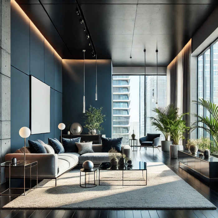
2020s: Bold, Moody Hues and Nature-Inspired Shades
In the current decade, bold and moody colors are back. Deep greens, navy blues, and charcoal grays are popular. These colors are often paired with earthy tones inspired by nature. Homeowners are embracing more dramatic color choices to create cozy, intimate spaces, while also incorporating biophilic design elements.
Key Colors of the Era:
- Deep Emerald Green
- Navy Blue
- Charcoal Gray
- Terracotta
Why It Matters:
The 2020s reflect a desire for homes to feel like sanctuaries. Bold, grounding colors create warmth and comfort, while nature-inspired tones promote relaxation and a connection to the outdoors. The rise of sustainable and eco-friendly design practices has also influenced the popularity of natural, earthy colors.
Influence on Modern Design:
The emphasis on bold, dramatic colors has led to the resurgence of statement walls and rich, layered interiors. Homeowners are increasingly using color to create mood and define spaces within their homes.
Final Thoughts
The history of popular paint colors offers a fascinating glimpse into the cultural and societal shifts of each era. Paint trends have changed a lot from the earthy tones of the early 1900s to the bold colors of the 2020s. These trends show how our tastes and values keep evolving. As we think about the future, one thing is clear—color will always be important. It helps us express ourselves and make spaces feel like home.
Views Expressed Disclaimer
The views, opinions, and information presented in this article are for informational purposes only and do not necessarily reflect the official policies or positions of Chagrin Falls Painting. While every effort has been made to ensure accuracy, Chagrin Falls Painting is not liable for any errors, omissions, or decisions made based on the content provided. Readers are encouraged to consult professionals for specific advice or assistance related to their unique circumstances.