As an Amazon Associate, I earn from qualifying purchases. Privacy Policy / Terms
Choosing the right paint color can transform a small space. It can make it feel larger, brighter, and more inviting.
But how do you choose the perfect shade?
This guide will help you navigate the world of small space paint colors. It’s packed with practical tips and tricks to make your small rooms feel spacious and stylish.
We’ll explore how light and neutral colors can open up a room. We’ll delve into the impact of cool tones and glossy finishes. We’ll even reveal how to use dark colors strategically to add depth and drama.
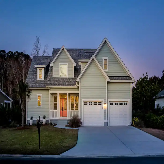
 by Mae Mu (https://unsplash.com/@picoftasty)
Whether you’re sprucing up a tiny kitchen or a compact living room, this guide has got you covered. So, let’s dive in and discover how to make the most of your small spaces with paint.
Understanding the Impact of Color in Small Spaces
Color significantly alters how we perceive small spaces. Certain colors can open up a space, while others might make it feel tight. Understanding these effects is crucial when decorating small areas.
Light colors, like pale blues and soft creams, can make a room feel airy. They reflect more light, which can visually expand the room. These colors create an inviting atmosphere without overwhelming the senses.
 by Marcus Dall Col (https://unsplash.com/@marcusdallcol)
Conversely, dark colors can often feel enclosing in small spaces. However, when used thoughtfully, they add depth and coziness. The key is to balance dark hues with lighter elements in the room.
Colors do not just influence the perception of space; they also affect mood. Bright shades can energize, while cooler hues can calm. This psychological aspect of color should guide your choices. A color that enhances your space will also enhance your mood.
 by Jeremy Bishop (https://unsplash.com/@jeremybishop)
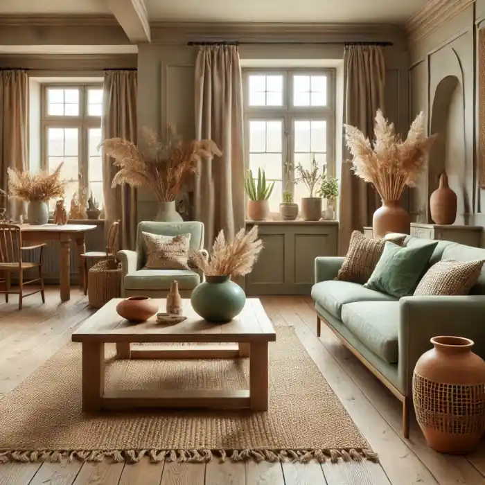
Light and Neutral Colors: The Foundation for Spaciousness
Light and neutral colors are a staple for small spaces. They create an illusion of more space by bouncing light around. Think of shades like soft whites, gentle grays, and light beiges. These hues provide a perfect backdrop for any room.
A primary advantage of neutrals is their versatility. They pair seamlessly with various decor styles. Whether you prefer modern, rustic, or classic themes, neutral tones will fit perfectly.
Here are some popular light and neutral color choices:
- Soft white
- Light beige
- Gentle gray
- Cream
- Pastel shades
Using these colors consistently across your walls, trim, and ceilings can simplify the visual field. This approach makes the space feel less cluttered. Simplicity in color can enhance the feeling of spaciousness.
 by Thaddaeus Lim (https://unsplash.com/@th4d)
Additionally, these colors act as a canvas for colorful accents. Accessories like pillows and rugs can easily stand out against a neutral backdrop. They allow you to change themes seasonally without repainting.
 by Evie S. (https://unsplash.com/@evieshaffer)
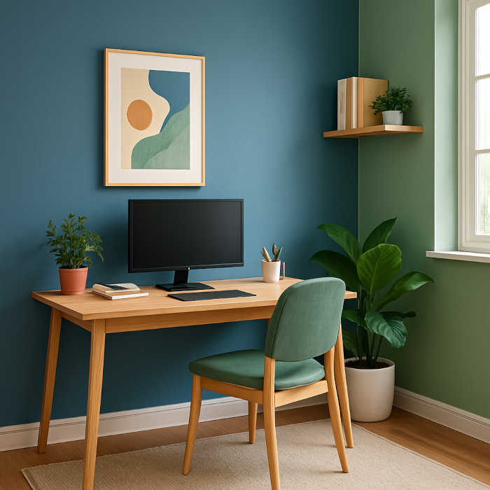
Cool Tones and Glossy Finishes: Creating Depth and Reflection
Cool tones like blues and greens can transform small spaces. These colors tend to recede visually, making walls appear further away. This effect adds perceived depth, opening up the room and enhancing its dimensions.
Glossy finishes complement cool tones perfectly by reflecting light. These shiny surfaces can amplify natural sunlight, brightening the space. Consider using a satin or semi-gloss paint finish for an additional reflective quality.
 by Aedrian Salazar (https://unsplash.com/@aedrian)
Incorporating cool tones with a glossy finish in kitchens or bathrooms can be particularly effective. These environments often benefit from the ease of cleaning that comes with glossy paint. Moreover, the reflective nature can make even the tightest of spaces seem airy and comfortable. Choose complementary decor items to enhance this effect, creating a cohesive and expansive look.
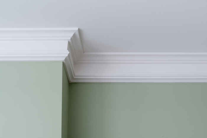
The Ceiling: An Often Overlooked Canvas
Ceilings can greatly influence the perception of space in a room. Often overlooked, painting the ceiling a lighter color than the walls can enhance the feeling of height. This technique draws the eye upward, creating an illusion of a taller ceiling.
Choosing a subtle shade for the ceiling, like a soft white or a pale pastel, can make a significant difference. It harmonizes the room, allowing other features to stand out without overpowering the space. Using paint with a slight sheen adds a gentle glow, further contributing to the room’s openness and airiness.
 by Mike Dorner (https://unsplash.com/@dorner)
Monochromatic Schemes and Color Flow: Simplifying Your Space
Embracing a monochromatic color scheme can streamline your small space. By using variations of a single color, you reduce visual clutter. This approach simplifies the room, making it feel more open and cohesive.
A monochromatic scheme harmonizes well with existing decor. It allows different elements, like furniture and fabrics, to seamlessly blend together. By keeping the palette consistent, the room feels larger and more unified.
For a cohesive look, consider these ideas:
- Use varying shades of your chosen color for walls, trim, and furniture.
- Incorporate textures to add depth, like woven fabrics or wood grains.
- Choose accessories that complement the primary hue without contrasting too much.
Creating a consistent color flow can open up even the smallest areas. This technique enhances spatial perception, establishing a continuous feel from one room to the next. As a result, small spaces appear more inviting and connected.
 by Tyler van der Hoeven (https://unsplash.com/@tyvdh)
Strategic Use of Dark Colors and Accent Walls
Dark colors often intimidate when decorating small spaces, but they can be quite effective. When used strategically, these colors add depth and drama. A well-placed dark accent wall can transform a room, providing contrast and focus.
An accent wall draws the eye and anchors the space. This technique breaks up a room’s monotony without overwhelming it. By painting the farthest wall a deep shade, you create the illusion of distance, enhancing the room’s depth.
To prevent overpowering a small space, balance is essential. Pair dark walls with lighter tones and reflective surfaces. This ensures that the room remains inviting and open. Consider adding mirrors or metallic accents to reflect light and maintain a sense of balance.
 by Simon Berger (https://unsplash.com/@simon_berger)
Incorporating Patterns and Textures: Stripes and Mirrors
Using patterns and textures in small spaces can add character and dimension. Stripes, in particular, are excellent for manipulating perceptions of space. Vertical stripes give the impression of higher ceilings, while horizontal stripes can expand a room’s width.
Mirrors are another powerful tool in small spaces. They reflect light and visually double the room. A well-placed mirror opposite a window can significantly brighten and enlarge the feel of a room.
To effectively incorporate these elements, consider the following:
- Use vertical stripes for height and horizontal for width.
- Position mirrors to catch natural or artificial light.
- Mix subtle textures to add depth without clutter.
Applying these techniques can make a small space feel inviting and stylish. Stripes and mirrors enhance visual interest, playing with light and perspectives to create a more expansive environment.
 by Jonatan Pie (https://unsplash.com/@r3dmax)
 by Bhushan Sadani (https://unsplash.com/@bhushan07)
Small Space, Big Style: Small Kitchen Paint Colors and Decor
Small kitchens can be challenging, but the right paint colors can work wonders. Opt for soft neutrals like light greys or whites for an airy feel. These colors can make cramped spaces feel open and inviting.
Accent colors can add personality without overwhelming the room. Consider pastel blues or muted greens for the cabinets or island. These hues are subtle yet stylish, transforming a small kitchen into a visually appealing space.
Incorporate decor that complements your color scheme. Use bright backsplash tiles or colorful accessories to add interest. Choose decor items that are both functional and fashionable to maintain the room’s visual flow.
 by Art Institute of Chicago (https://unsplash.com/@artchicago)
 by Julian Berengar Sölter (https://unsplash.com/@moinundmeer)
Testing Colors and Lighting: Ensuring the Perfect Match
Testing paint colors in your small space is crucial. Colors can look different throughout the day. A shade that appears bright in the morning might seem dull at night.
To ensure you’re making the right choice, test samples on your walls. Observe them at different times and under various lighting conditions. This will give you a true sense of how the color will live in the space.
 by Bernard Hermant (https://unsplash.com/@bernardhermant)
Accessorizing with Color: Flexibility and Seasonal Changes
Adding color through accessories offers flexibility that paint alone can’t. Use pillows, rugs, and curtains to inject seasonal hues. This approach allows easy updates as trends and tastes evolve.
Consider rotating decor items to align with different seasons. Warm tones can replace cooler shades in winter, enhancing the room’s ambiance. This method keeps your space feeling fresh year-round.
 by Shamblen Studios (https://unsplash.com/@shamblenstudios)
Conclusion: Bringing It All Together
Choosing the right paint colors can dramatically impact the feel of a small space. By using strategic paint choices and techniques, you can create an inviting and spacious environment. It’s about finding harmony between colors, lighting, and decor.
Experimenting with light, cool, and reflective tones helps maximize light and depth. Remember, accessories and minor adjustments can bring vibrant changes. With careful planning, any small space can transform into a stylish and larger-feeling haven.
 by Mae Mu (https://unsplash.com/@picoftasty)
FAQs About Small Space Paint Colors
Q. Can dark colors ever work in small spaces?
Yes, dark colors can work if used wisely. You can apply them as an accent wall to create depth and interest. Pairing them with lighter colors keeps the space balanced and prevents a cramped feeling.
Q. How do I choose a paint color for a small room with little natural light?
In rooms with little natural light, opt for warm, light colors. These hues reflect artificial light well and create an open, airy atmosphere. Testing samples in varied lighting conditions ensures you select the best shade.
Q. What are some eco-friendly paint options for small spaces?
For a greener option, choose low-VOC or zero-VOC paints. These eco-friendly choices reduce harmful emissions and improve indoor air quality. Brands offer a range of colors, allowing you to achieve beauty without compromising health.
Views Expressed Disclaimer
The views, opinions, and information presented in this article are for informational purposes only and do not necessarily reflect the official policies or positions of Chagrin Falls Painting. While every effort has been made to ensure accuracy, Chagrin Falls Painting is not liable for any errors, omissions, or decisions made based on the content provided. Readers are encouraged to consult professionals for specific advice or assistance related to their unique circumstances.