As an Amazon Associate, I earn from qualifying purchases. Privacy Policy / Terms
When it comes to creating a peaceful home, most people think of decluttering or adding soft lighting—but the paint color on your walls might have the biggest impact of all. Whether you’re planning a full interior refresh or updating a single room, understanding color psychology can transform how your space feels. The right paint choice influences how we feel, how we move through space, and how we interact with others in our environment. As professional painters, we’ve seen firsthand how the right color—applied with the proper finish and technique—can turn any room into a calming retreat.
Blue: The Go-To for Tranquility
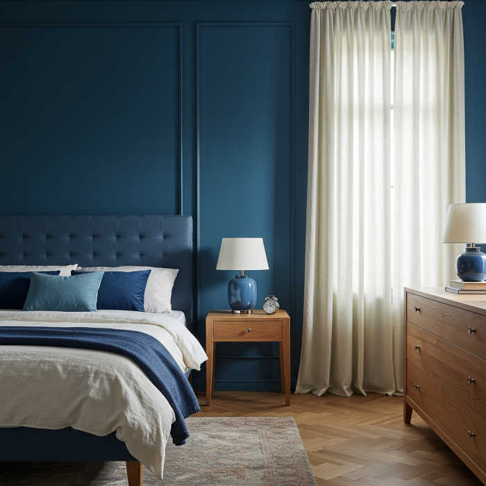
Blue is often associated with serenity, stability, and peace—which is why it’s one of the most requested colors for bedroom and bathroom painting projects. Lighter shades like sky or powder blue work especially well in these spaces, where relaxation is key. When applied with a matte or eggshell finish, these soft blues diffuse light beautifully and create that spa-like atmosphere homeowners love. Deeper navy tones can add a sense of grounded calm to living rooms or home offices, though we recommend pairing them with lighter trim to prevent the space from feeling too enclosed.
If you’re painting with a deeper blue, consider balancing it with light wood furniture or cream-colored curtains to keep the space feeling open and airy. Even a small touch like a ceramic vase or throw pillow in a complementary blue tone can reinforce the calming theme throughout the room.
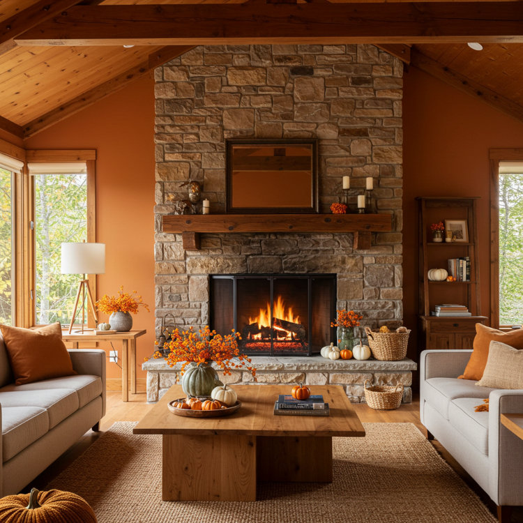
Green: Nature’s Neutral
Green bridges the gap between color and nature, making it one of our most versatile painting options. Associated with renewal and balance, it’s one of the easiest colors on the eyes and works beautifully in just about any room. We’ve painted countless kitchens, entryways, and bedrooms using soft sage, eucalyptus, and olive sprig tones—these earthy greens create an instant sense of calm without feeling too bold or trendy.
When paired with textured materials—think linen throws, natural wood, or soft cotton area rugs—green becomes even more effective at reinforcing a grounded, peaceful vibe. A strategically placed plant (real or faux) can also make a huge difference in completing the look. Professional tip: green looks especially rich when applied in two coats with proper primer, which brings out the depth and prevents any streaking.
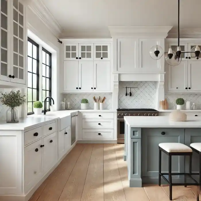
Neutrals: Soft, Simple, and Versatile
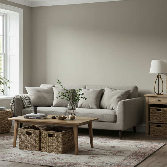
Beige, ivory, taupe, and greige aren’t just safe choices—they’re genuinely soothing and timeless. These subtle hues allow your mind to rest, especially when painted with matte or flat finishes that soften natural light rather than reflect it. A room painted in a well-chosen neutral becomes a blank canvas for adding soft, calming elements like plush textiles or ambient lighting, and it gives you the flexibility to change your décor without repainting.
Consider layering textures: a nubby throw blanket, a soft area rug, or woven storage baskets can add dimension without visual clutter. Neutrals are also perfect for high-traffic areas or open floor plans where you want a cohesive flow between rooms. When painting larger spaces in neutrals, proper surface preparation and even coverage are critical—any imperfections will show in these lighter shades, which is why many homeowners choose to work with experienced painters for these projects.
Lavender and Soft Pink: Understated Elegance
While bold pinks and purples can feel intense, their lighter counterparts have a surprisingly calming effect that works beautifully in residential spaces. Lavender evokes a spa-like calm and is particularly popular for primary bedrooms, while posy pink adds warmth without overstimulating the senses—perfect for creating a gentle, welcoming atmosphere.
These hues are ideal for nurseries, guest rooms, or cozy reading nooks. When painting with these softer tones, we recommend keeping the palette muted by combining them with pale neutrals, soft metallics, or diffused glass décor to avoid overpowering the space. A satin finish works well here—it provides easy cleanability (important in nurseries) while maintaining that soft, calming effect.
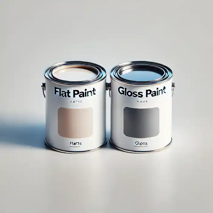
The Power of Finish and Light
Here’s something many homeowners don’t realize: the color itself is only half of the equation. The paint finish and surrounding lighting also dramatically shape the mood of a room. Flat and matte finishes diffuse light and create a softer, more intimate feel—these are our go-to recommendations for bedrooms and low-traffic areas where you want maximum calm. Satin or eggshell finishes add just enough sheen for depth and durability without harsh reflection, making them ideal for living areas and hallways.
Natural light softens most paint tones beautifully, but in darker spaces or north-facing rooms, you might consider layering in warm LED bulbs or adding dimmable accent lighting to enhance the calm effect. During color consultations, we always evaluate your home’s natural lighting before making final recommendations—the same color can look completely different in a sun-filled kitchen versus a basement bedroom.
Conclusion: Paint With Purpose
Creating a calm home doesn’t require a total redesign—it starts with intentional choices about color, finish, and application. The paint on your walls should support the atmosphere you want to live in, and when applied properly with quality materials and experienced technique, it can transform how your entire home feels.
If you’re ready to transform your space, a professional paint job with the right color and finish might be all it takes to make home feel more like home. Whether you’re painting one accent wall or refreshing your entire interior, Chagrin Falls Painting can guide you through the color selection process and ensure flawless results. We’ll help you choose calming colors that work with your home’s lighting, bring samples for you to test in your actual space, and apply them with the precision and care that makes the difference between a DIY attempt and a truly serene sanctuary.
Ready to create your calm space? Contact us for a free consultation and color advice tailored to your Northeast Ohio home.
Views Expressed Disclaimer
The views, opinions, and information presented in this article are for informational purposes only and do not necessarily reflect the official policies or positions of Chagrin Falls Painting. While every effort has been made to ensure accuracy, Chagrin Falls Painting is not liable for any errors, omissions, or decisions made based on the content provided. Readers are encouraged to consult professionals for specific advice or assistance related to their unique circumstances.